The problem: Enrolling with our product was a complex and overwhelming process completed across various channels: emails, phone calls, and an assortment of disjointed online portals. It wasn't a great first impression, and we received a lot of negative feedback about it. However, internally, it was difficult to get buy-in to address this issue.
The project: Illustrate how much better the enrollment experience could be. Highlight the overall experience instead of fixating on smaller details.
The goal: To show stakeholders that we should invest time and resources to improve the enrollment experience.
These designs became a clickable prototype that I presented to the CEO and other business stakeholders.
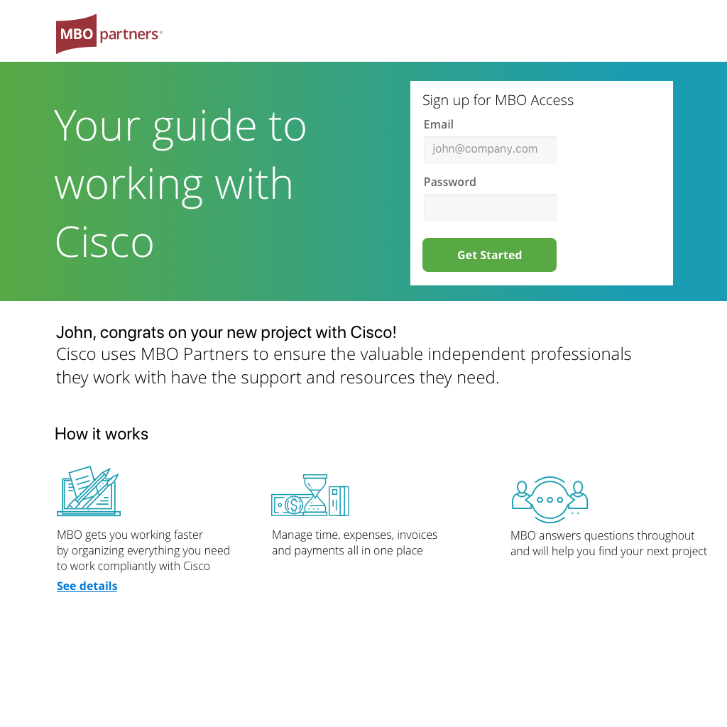
Welcome screen for enrollment experience.
We routinely heard from users that they were overwhelmed by the volume of tasks required for enrollment. This redesign made the experience more conversational and asked questions in a more digestible manner. The progress bar lets them know where they stand in the process.

One part of the previous process that users loved was their interactions with their enrollment managers, subject matter experts assigned to them who could answer any questions they had. We didn't want to lose that personal touch in the new online experience, so the contact information for that enrollment manager is always readily available to users in this experience.

In the interest of making this experience less overwhelming, related details are only revealed after the user selects an answer, and responses are optional in case they don't have that information handy.

Next steps are outlined clearly so users know what comes next in the enrollment process.


The enrollment task manager below gives users an overview of their to-dos (highlighted in green so they stand out), in-process tasks (with progress bars to indicate time remaining), and completed steps (in case the user wants to revisit documents they already submitted).

The dashboard gives an overview of where users stand in the process with a snapshot of upcoming steps. As always, the contact information for your enrollment manager persists. All messaging occurs within the web experience, eliminating email back-and-forth that previously frustrated users.

The next two screens illustrate the experience once a user completes enrollment. Finding their next project and billing their clients would all happen in one place.


The outcome: This illustrative overview helped my CEO and business stakeholders envision the future of our enrollment experience. Ultimately, they chose to prioritize and move forward with an experience like this one.

